Catalogue
Journal

Japandi interiors: origins, characteristics and décor ideas

Japandi is built on simplicity, quiet and attention to materials. Decoration should feel intentional: every object supports a balance of function, texture and breathing space.

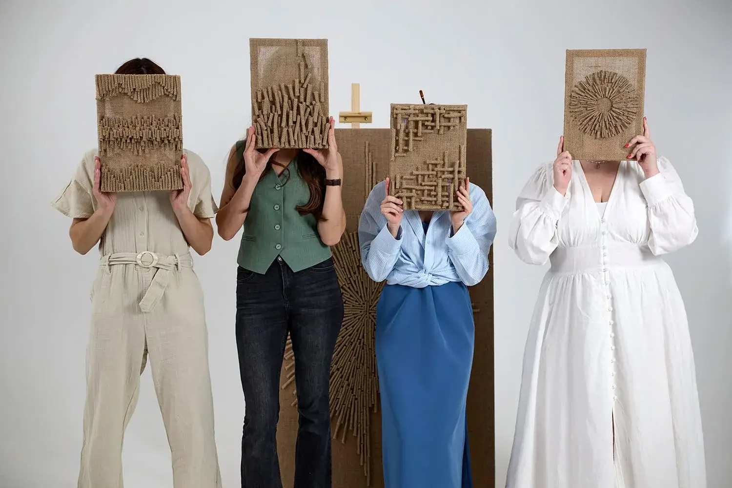
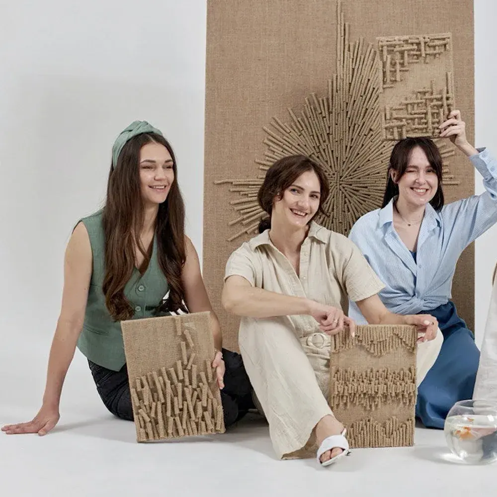
The BABENKI team with jute artworks in a calm, light-filled studio
(01)

Why Japandi remains relevant

Japandi combines Japanese simplicity with Scandinavian warmth. It values clear lines, practical objects and a restrained palette. The aim is not an empty-looking room, but an ordered space that is comfortable to use every day.

Natural materials keep Japandi from feeling cold. Wood, linen, wool, ceramics and jute soften a space without disrupting its minimalist structure. Texture takes the place of excessive decoration: a wall can be quiet in colour yet rich in feeling.

(02)

From Japandi to modern organic

Western interior publications often connect the appeal of calm spaces with modern organic design, wabi-sabi and texture schemes as well as Japandi. Architectural Digest describes contemporary interiors through clean lines, neutral colour schemes and natural materials such as carved wood and jute rugs. The logic is close to Japandi: less visual noise, greater attention to the surface.

In its coverage of a texture-first approach, Homes & Gardens describes texture as a room’s main language, particularly in a minimalist palette. Better Homes & Gardens highlights jute’s natural colour, organic quality and versatility. A jute artwork can therefore replace brightly coloured art in a Japandi interior while preserving depth and a handmade character.

(03)

Which artworks suit the style

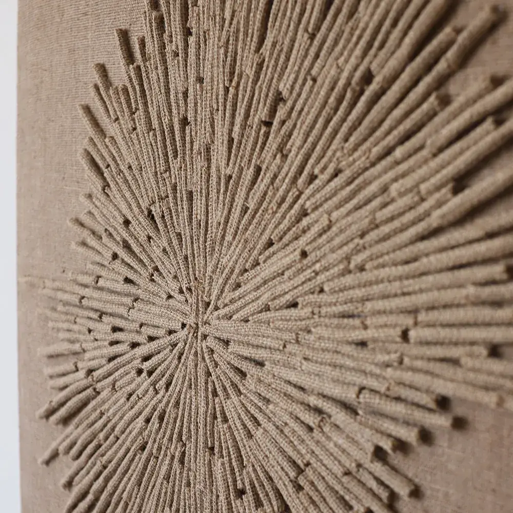
Relief compositions with gentle contrasts work especially well. Jute’s natural colour supports the Japandi palette, while handmade texture adds depth without decorative overload. A piece can be large without being loud: shadow, rhythm and scale give it presence.

The form may be asymmetrical, but should remain calm. Look for a composition that is interesting up close and coherent from a distance. Avoid overly complicated narratives: the artwork should create a mood of quiet, order and natural clarity.

(04)

Palette and materials

Japandi relies on warm whites, greige, sandy tones, wood colours and muted dark shades. Jute acts as a connecting material: it softens white walls, supports wood and works alongside stone or ceramics. In a cool grey interior, it introduces a warmer note.

Build different tactile layers to prevent monotony: smooth plaster, matte ceramics, woven fibre, soft textiles and wood with visible grain. Interior magazines often recommend layering texture, rather than adding another colour whenever a room needs more expression.

(05)

Avoiding overload

Choose one expressive artwork for the main wall and leave room around it. If nearby shelves, plants or sculptural lighting already attract attention, keep the relief softer. Empty space is particularly important in Japandi: it lets each object speak more clearly.

Too many similar woven objects can compete with one another: baskets, rugs, lampshades and wall art all demand attention. Choose a principal textured accent and support it with quieter materials. The room will feel considered rather than merely natural.

(06)

Light, scale and a sense of quiet

Soft light is important to Japandi. Side lighting brings out a jute artwork’s relief, but should not become overly theatrical. A calmer lighting scheme suits the style’s philosophy; in the evening, texture should create depth and a sense of shelter.

Choose a scale that relates confidently to the furniture. A small panel on a large empty wall may seem accidental, while a large piece with a soft rhythm can make an interior feel calmer. Japandi favours clear decisions: one strong gesture can work better than many small ornaments.

Let’s find the right artwork for your interior