Catalogue
Journal

How to choose the right size for wall art

Size determines whether an artwork feels confident or accidental. The mistake is often one of scale rather than style: a small piece disappears, while an oversized one competes with the room’s architecture.

A BABENKI artwork in a light interior
(01)

Start with the furniture

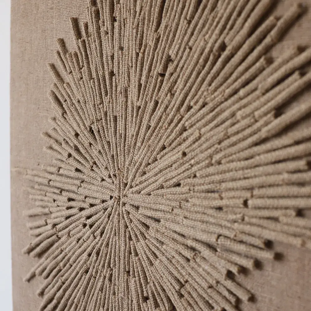
Above a sofa, chest of drawers or bed, an artwork’s width can be close to two-thirds of the furniture’s width. This is a starting point rather than a strict rule. Scale matters especially for relief works: texture adds visual weight, so a small panel can feel denser than a poster of the same size.

Horizontal formats or two vertical panels often suit a bed. Above a console or in a dining area, an elongated piece can echo the line of the furniture. If the furniture is low, leave enough space above the artwork so it does not feel pressed against the ceiling.

(02)

What interior publications suggest

Western magazines rarely discuss art size separately from a room’s overall composition. Architectural Digest and Homes & Gardens often treat natural texture as a layer working alongside furniture, light, textiles and architecture. Choose the scale of a relief artwork according to its role in the room, as well as the wall’s dimensions.

In its coverage of natural fibres, Better Homes & Gardens explains that jute, rope wall art, rattan and woven elements can add visual interest and warmth to walls, floors and furniture. A jute wall piece should therefore read clearly from the distance at which the space is actually seen: the entrance, sofa, table or corridor.

(03)

Consider viewing distance

In a corridor or narrow passage, people see an artwork up close, making detail and careful relief important. A large scale is not always necessary: a precise composition that does not obstruct movement may work better. In a living room or restaurant, strengthen the silhouette and overall rhythm so the piece reads from a distance.

If you are unsure between two sizes, the larger option is often worth considering. Interior art should give the wall presence. This is particularly true of neutral textures, which rely on scale and light rather than colour to attract attention.

(04)

An empty wall and breathing space

A wall without furniture needs a thoughtful choice. A small piece may leave too much unintended emptiness around it. A large panel, diptych or series can form an architectural composition through the rhythm of several parts. Empty space should look intentional rather than unfinished.

There is no need to cover the entire wall. Natural texture often works because of the pause around it: a light wall, a substantial artwork, careful furniture and room to breathe. Each object gains its own place instead of disappearing into a collection of decorations.

(05)

Hanging height

The centre of an artwork is usually comfortable near eye level, but its actual height depends on the furniture and format. Above a sofa or headboard, leave a gap so the work does not press visually on the backrest. Over a console or chest of drawers, it can sit lower if vases, books or lamps form part of the arrangement.

Consider the shadows cast by jute relief. With a high light source, a low-hanging artwork can create a strong shadow on the wall or furniture. With side lighting, choose a height that reveals the texture both straight on and at a slight angle.

(06)

Check the size before ordering

Photograph the wall straight on and mark the proposed dimensions with painter’s tape. This quickly shows whether the scale suits the room. For a diptych or triptych, mark the spaces between parts as well as the total outline: a gap that is too large can break the composition.

For a hotel, restaurant or rental apartment, look from several viewpoints: the entrance, main route and seating area. Commercial spaces often need a stronger silhouette because guests see the artwork while moving and may not pause beside the wall.

Let’s find the right artwork for your interior