Catalogue
Journal

Jute art: natural aesthetics in a contemporary interior

Jute brings relief, warmth and a living, tactile quality to an interior. Its value lies not only in being natural, but in giving a calm space greater depth without unnecessary visual noise.

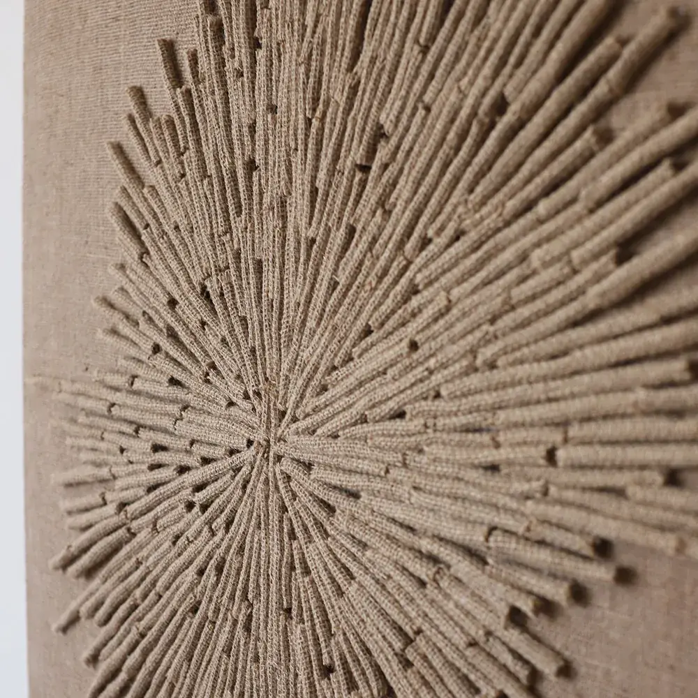
Close-up of the texture of a jute artwork
(01)

What makes jute expressive

Jute thread holds its shape well, allowing artists to compose graphic lines, sculptural rays and gentle transitions. Unlike a smooth print or poster, it interacts with light: the relief looks softer in the morning, deeper shadows appear in the evening, and side lighting makes the surface almost architectural.

The material is especially suited to interiors that value natural shades, craftsmanship and quiet texture. It connects wood, stone, linen and ceramics into a coherent composition. Jute needs no bright colour to stand out: its expression comes from fibre thickness, repetition, shadow and natural irregularity.
(02)

What Western interior publications say

In Western interior magazines, jute usually appears as part of the broader theme of natural texture rather than as an exotic material. Architectural Digest discusses woven textures as a way to make neutral interiors feel more alive and less sterile: woven materials, macramé, wicker and handmade decoration give a home character and a lived-in feeling.

Better Homes & Gardens describes jute as a natural fibre from the corchorus plant, used in home furnishings from rugs to upholstery. It highlights the material’s sustainability: jute renews quickly, requires relatively little chemical processing and suits minimalist, traditional and bohemian interiors. For wall panels, these observations matter because the artwork becomes a tactile layer of the space, rather than simply an ornament.

(03)

Why jute art works on a wall

A jute rug is usually seen as the foundation of a room. A wall artwork brings natural texture to eye level, creating an object to contemplate from the sofa, the entrance or an adjoining area. Its relief keeps it from looking flat, even within a monochrome palette.

An important difference from printed art is its changing appearance. Jute relief responds to daylight, evening wall lights and spotlights. In a room with little colour, depth prevents the wall from feeling empty and beige. In a colourful room, jute can provide a calm pause that brings the space together.

(04)

Where jute art looks its best

In a living room, a jute panel can become the main focal point above a sofa or console. Calmer forms and elongated proportions suit a bedroom, supporting its sense of quiet. Graphic compositions work well in dining rooms and open-plan kitchens because they are easy to read from a distance.

In public spaces, from restaurants to small hotels, jute gives an interior a distinctive identity. A large textured work reads well at a distance and needs no bright colour to be memorable. In its hotel décor coverage, Better Homes & Gardens highlights rope wall art, woven baskets, rattan and jute rugs as ways to convey warmth and craftsmanship.

(05)

Choosing size and composition

Take your cue from the furniture beside the artwork. Above a sofa, a piece usually looks harmonious at around two-thirds of its width. A vertical format suits a narrow wall, while a horizontal diptych or triptych works above a long console. Relief art carries more visual weight than a poster, so leave breathing space around it.

If the interior is already rich in decoration, choose a quiet pattern with less contrast. A minimalist space can accommodate a larger relief and a more complex composition. Plan the light in advance: side lighting makes the texture more active, while diffuse daylight softens its appearance.

(06)

What to pair it with

Jute works well with matte walls, light wood, linen, wool, ceramics and stone. In contemporary interiors, it is particularly expressive beside smooth surfaces: a painted wall, simple furniture, a stone worktop or even plaster. The calmer the background, the clearer the craftsmanship becomes.

Avoid filling one area with several assertive woven textures. If there is already a strongly textured jute rug, choose a quieter rhythm for the wall piece or place it on another wall. A good interior depends on the balance of natural materials, rather than their quantity.

Let’s find the right artwork for your interior