Catalogue
Journal

Relief art in the bedroom: a gentle accent without overload

Decoration should feel quieter in a bedroom than in a living room. A relief artwork can be the main focal point while preserving a sense of calm and completeness.

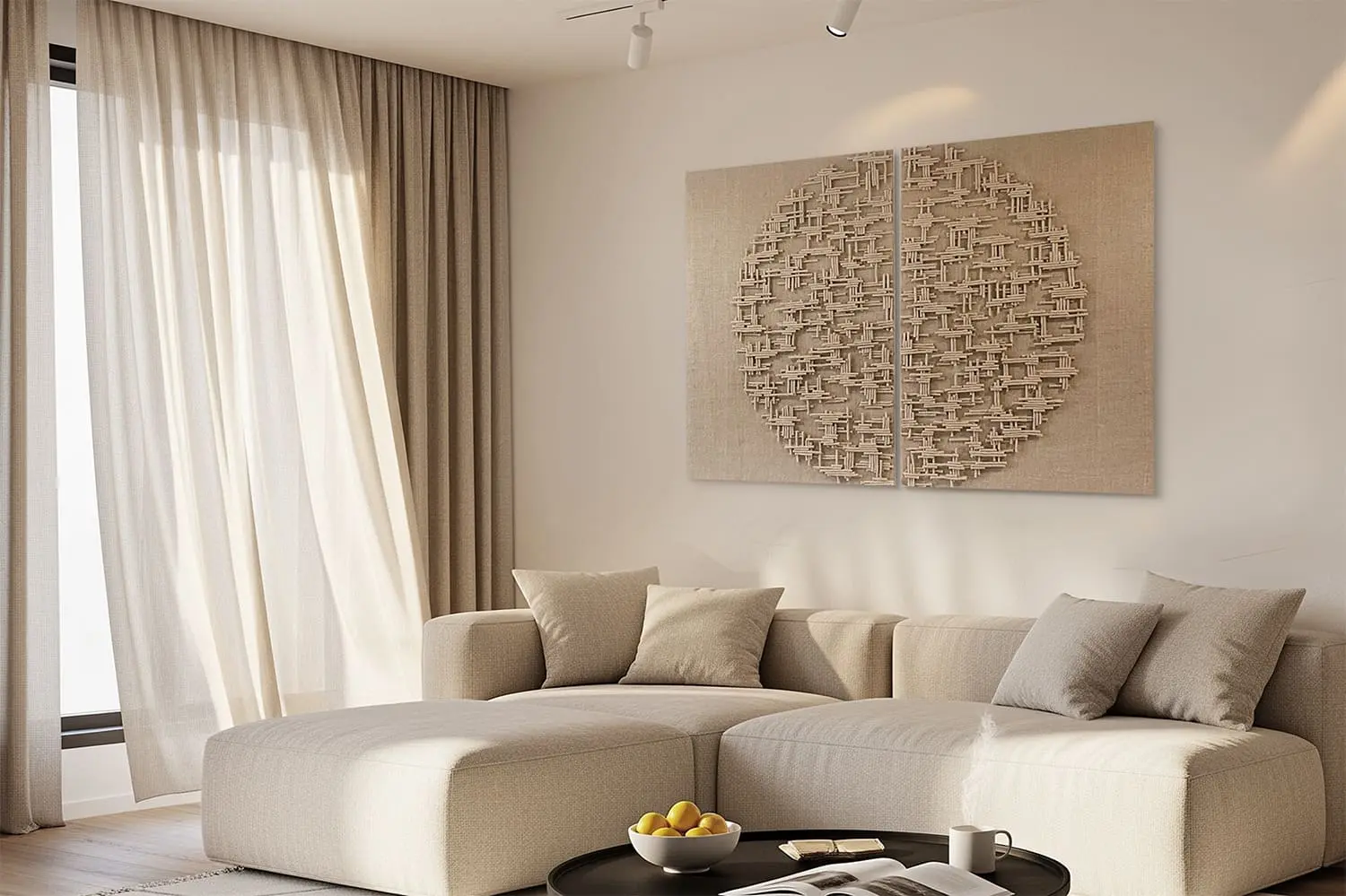
A BABENKI diptych in a natural colour palette
(01)

Choose a calm rhythm

Elongated lines, soft symmetry and natural shades work well above a headboard. A fragmented pattern can create tension, especially beside strongly textured textiles. The eye should rest in a bedroom, so make the relief expressive without being aggressive.

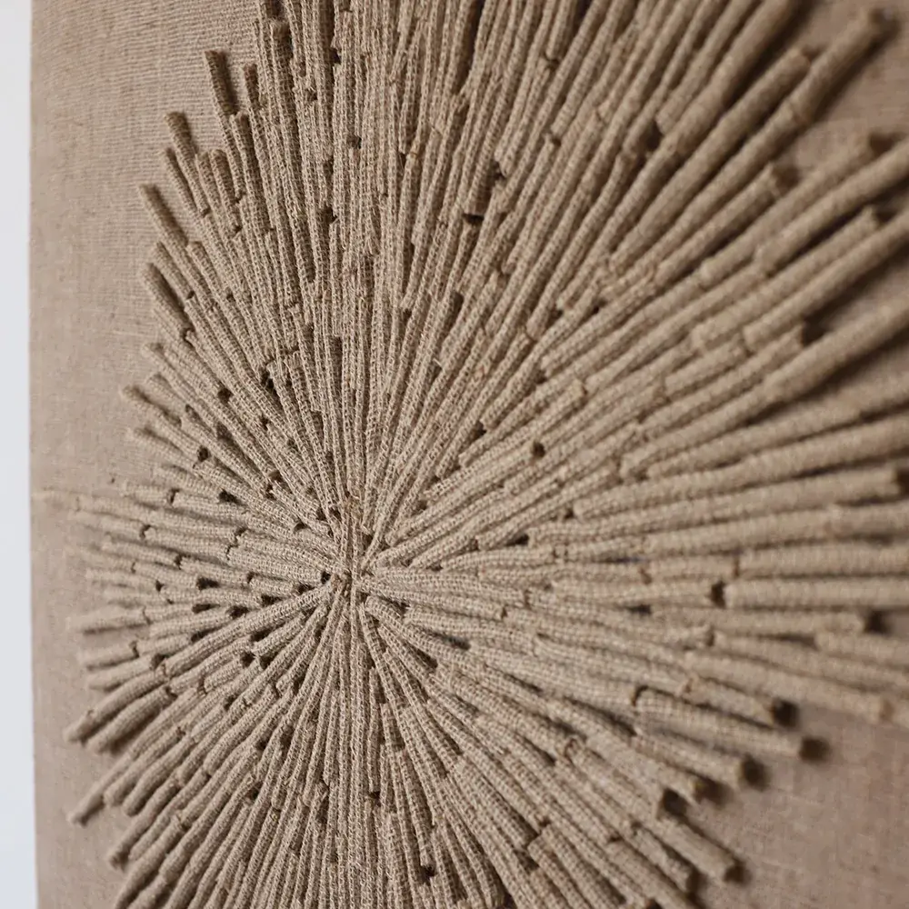
Jute, linen and muted natural colours support warm lighting and soften the room visually. The material stays warm even on a large wall, adding a handmade layer without turning the bedroom into an exhibition space.

(02)

Natural fibres in the bedroom

Better Homes & Gardens describes jute as a natural material with a characteristic brown shade that fits both minimalist and traditional interiors. In the bedroom, this approach is useful: natural fibre brings a calm, grounded feeling as well as a decorative quality.

Homes & Gardens connects texture in interior design with the way a room feels physically. The bedroom is especially sensitive to this: both the object on the wall and the rhythm of its surface matter. A jute panel can replace more active, colourful art while keeping a soft natural palette.

(03)

Work with the light

Relief is particularly beautiful in side lighting. Wall lights, directional light or morning sun emphasise depth and keep the work alive throughout the day. Avoid overly sharp shadows in a bedroom: their drama does not always suit a place for rest.

Light falling from the front creates softer shadows, a useful option when strong contrast is unnecessary. Choose warm lighting and position its source to reveal the texture gently. The artwork can then change its mood in the evening without becoming distracting.

(04)

Where to place the panel

Above the headboard is an obvious position for horizontal formats, diptychs and elongated compositions. A wide bed needs a sufficiently large piece. If the headboard is already tall and textured, move the artwork to a side wall or choose a simpler relief.

A wall opposite the bed makes the work the first thing seen in the morning, so choose a quiet pattern with gentle contrasts. Another option is beside an armchair, dressing table or chest of drawers, where the panel can bring a small, peaceful corner together.

(05)

Balance it with textiles

If the room already has an expressive bedspread, curtains or rug, keep the artwork simpler. Plain textiles allow for a more complex relief. One active element in the field of view keeps an interior coherent and restful.

Jute pairs well with linen, cotton, wool and matte wood. If every element is too similar in tone, however, the room can feel flat. Introduce nuances: milky textiles, darker wood, light ceramics and a soft shadow on the wall. Natural materials need not become an unvarying beige background.

(06)

Size and mood

A large bedroom panel can feel very calm if its rhythm is soft and its colour natural. A small piece may instead look accidental. First decide its role: a principal accent above the bed, a quiet object beside an armchair or a pair providing symmetry.

Test the scale with painter’s tape and view it in the morning and evening. Relief changes with light, so a daytime choice may become too active under night lighting. If mirrors or glossy surfaces are nearby, check their reflections so the texture does not create visual noise in the resting area.

Let’s find the right artwork for your interior