Catalogue
Journal

Natural materials in interiors: jute, linen and wood

Natural materials are valued for more than their environmental qualities. Irregular fibre, matte surfaces and the natural play of light give an interior a depth that imitation struggles to reproduce.

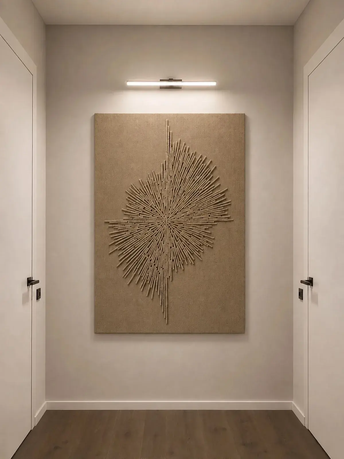
A BABENKI relief panel with a radiating composition in a light hallway
(01)

Why natural texture matters again

The calmer an interior’s palette becomes, the more important its materials are. A white or beige room can feel empty if its surfaces lack variation. Jute, linen, wood, stone and ceramics add a tactile quality, bringing depth and a sense of time.

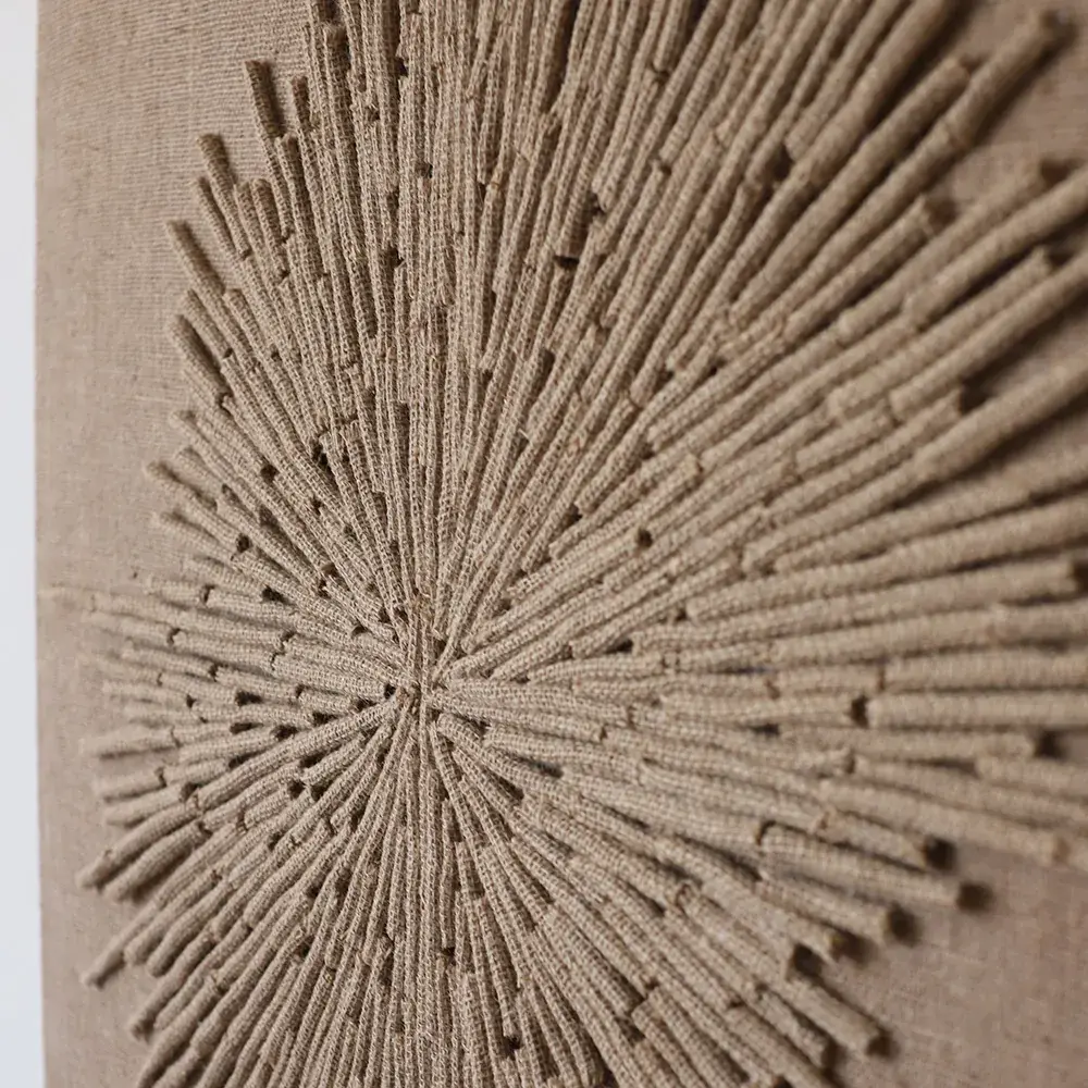
Western publications increasingly discuss texture schemes: designers compose rooms from matte, smooth, rough, soft and woven surfaces rather than colour alone. Jute art fits this approach because it serves as both a relief surface and an artwork.

(02)

What magazines say about jute

Better Homes & Gardens explains that jute comes from the corchorus plant and is used in home decoration from rugs to upholstery. It highlights the fibre’s natural brown colour, practicality and sustainability: jute renews quickly and needs relatively little chemical processing.

In its coverage of natural texture, Architectural Digest discusses wicker, jute, bamboo and other natural materials in urban apartments as well as beach houses. Natural texture belongs to no single style: it can be part of minimalism, contemporary design, modern organic, Japandi or soft classical interiors.

(03)

Build a palette of related shades

Jute pairs well with warm wood, sandy walls, milky textiles and handmade ceramics. Introduce different textures within a calm palette to prevent monotony. The colour difference can be almost invisible while the surface difference is tangible.

Contrast can come from depth rather than colour: a smooth wall, rough panel, soft linen and solid wood look richer together. Such interiors age well visually because they do not depend on a single fashionable shade.

(04)

Watch the colour temperature

If the wood has a reddish tone, a jute artwork can support that warmth and connect it to the rest of the palette. In a cooler interior, choose lighter, quieter materials. Avoid mixing too many wood species and beige shades in a single room.

Natural schemes need the same discipline as colourful interiors. If every element is warm, a room can feel heavy; if everything is cool, it loses comfort. Jute sits between decoration and neutrality, softening contrast or bringing warmth to a strict scheme.

(05)

Add craftsmanship selectively

One large panel or a pair of small pieces can make an interior warmer. Too many handmade textures can make it feel accidental. A good artwork completes the room’s composition instead of merely filling an empty spot.

Handmade texture is especially valuable beside precise industrial surfaces: fitted furniture, smooth fronts, glass, concrete and painted walls. This contrast brings life. Give each layer a role so the room does not become a catalogue of natural materials.

(06)

Practicality and care

Jute wall art is not exposed to the same contact as rugs or upholstery, so its wall-mounted format keeps the material in calmer conditions. Place it away from constant moisture, strong kitchen steam and areas where hands or bags regularly brush it.

Gentle dry dusting with a soft brush or a careful vacuum attachment on low power is usually enough. Avoid rubbing the fibre with a wet cloth or using aggressive products. Like other natural materials, jute benefits from gentle handling and a stable environment. A well-ventilated room helps it retain its texture without complicated maintenance, making it suitable for living rooms and calm public areas.

Let’s find the right artwork for your interior