Catalogue
Journal

Art for a restaurant or hotel: capturing the atmosphere

In a restaurant, hotel or café, an artwork works alongside service, lighting and the guest’s journey. It sets the tone and helps the interior remain recognisable.

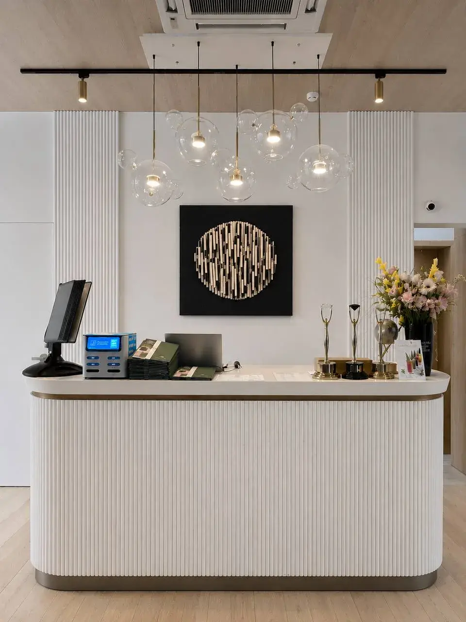
A BABENKI relief panel above a reception desk in a light interior
(01)

Start with the guest’s journey

Consider where a guest first sees the space: the entrance, reception, waiting area or main room. A large artwork can become a visual point of memory there. The aim is to create a scene that a guest associates with the place.

Passing areas need a strong composition that reads quickly. More intimate rooms can use subtle texture that guests explore while seated. For a hotel or restaurant, the artwork should look good in person and in guests’ photographs.

(02)

Natural texture in hospitality

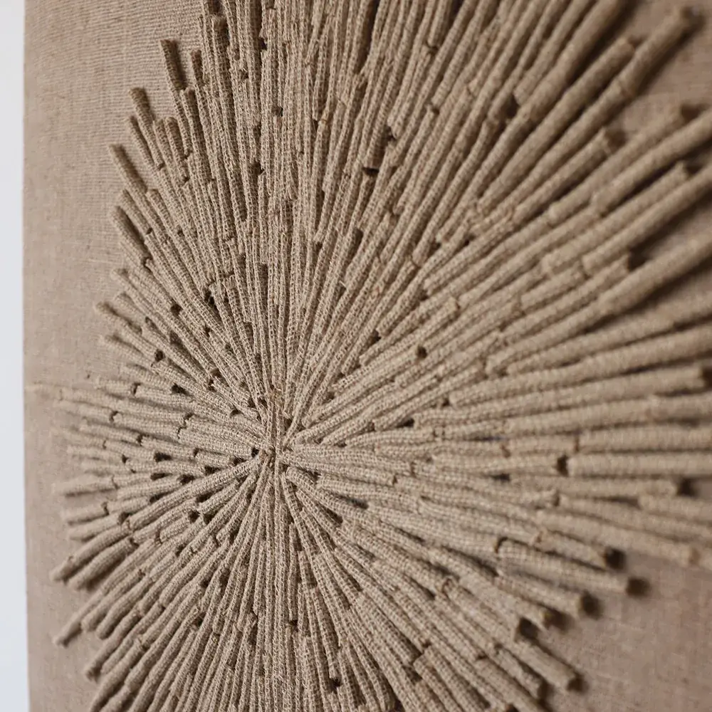
In an article on designers’ favourite hotel décor details, Better Homes & Gardens describes natural textures as adding warmth: woven baskets, rope wall art, rattan furniture and jute rugs feel handcrafted and inviting. This explains why textured jute art suits hotels and restaurants: it makes a space less anonymous.

Architectural Digest often connects expressive contemporary interiors with natural materials, texture and a lived-in feeling. This is valuable in commercial projects: a guest may forget the exact wall colour but remember a large relief object at the entrance or in the main room.

(03)

Connect the work to the concept

Soft organic forms and a light palette may suit a seaside restaurant; a stronger graphic rhythm and larger scale may suit an urban hotel. The work should belong to the place rather than feel like universal decoration. Natural jute communicates craftsmanship, a tactile quality and warm attention to detail.

If the brand values locality, handmade work, slow living or natural cooking, jute art can support those ideas without illustrating them literally. An abstract relief sometimes conveys the atmosphere more effectively through material, light and scale.

(04)

Scale for commercial spaces

A small artwork often disappears in a restaurant or hotel among movement, sound, people, tableware, light, textiles and furniture. A clear silhouette and sufficient size matter, especially at an entrance, reception, staircase, private dining room or a wall visible from the street.

On a long wall, a diptych or series may work better than one panel. Repeated rhythm guides the eye and connects areas. Choose the gaps carefully: too much distance fragments the composition, while too little removes its breathing space.

(05)

Plan for everyday use

Commercial spaces are used more intensively than homes. Discuss size, mounting, distance from guests, lighting and gentle maintenance in advance. The work should not obstruct passage, catch clothing or sit in an area of constant contact. Relief art works best with a safe distance around it.

A carefully planned artwork supports navigation and remains expressive under changing light. Restaurants have different daytime, evening and photographic settings. Check the chosen wall in the morning, afternoon and evening before making the piece.

(06)

Why texture is memorable

Guests rarely analyse an interior point by point, but quickly sense whether it is cold or warm, considered or accidental, alive or sterile. Natural fibre gives an impression of a handmade, human and attentive space. Its effect is gentler than a bright sign, but can remain in memory longer.

Jute art can become part of a business’s visual language. Related shades and rhythms can carry into menus, packaging, photo areas, bedrooms or private rooms without repeating the exact form. The artwork then becomes part of the brand rather than decoration added after renovation.

Let’s find the right artwork for your interior